Category Results:
Camp Creative Listed As The
Top Graphic Design Agency By Clutch
How do you convey what you are thinking without using a single word? Charades work but are too interpretive. Dance is an option but not everyone has rhythm. Smoke signals are fun but not ideal for indoor use. This leaves clear and compelling visual design to pick up the slack left by its cousins. With nonverbal communication, whether it be logo design, graphic design, iconography, animation or textual layout, most marketers agree: presentation is everything.
Commitment to User Experience Design
From full website design to graphic element design, everything we do starts with an understanding of the end-user. We take the time to understand what message needs to be sent and how to send it. Everything we design speaks with a clear voice and a carefully curated aesthetic specific to each client and each message. We find that approaching design with both strategy and creativity in mind delivers the best results for our clients and enables us to express complex ideas and emotions in simple, immediately understandable ways.
A Top Digital Service Provider
We have been ranked as the top graphic designer in San Francisco by Clutch, a B2B services consultancy based in Washington, DC. Clutch uses in-depth market research and client reviews to identify top service providers and help firms hire smarter. After evaluating almost 100 of the top graphic designers in San Francisco, Clutch named Camp Creative the number one agency.
Aside from our design capabilities, we have been recognized for our strategic digital marketing expertise with unrivaled SEO skills. This acknowledgement comes to us from The Manifest, a business resource that helps teams leverage their business challenges into opportunities for growth. They highlighted us for our ability to build attractive brands and help them be found a little more easily.
A Fan Favorite
In addition to the praise we have received from industry analysts, we have also received a number of verified reviews from our amazing clients.
When asked what they found impressive about Camp Creative, one client said:
“The way they balance creativity and data management is pretty impressive. It’s rare to find a company with that balance.”
And when asked about the impact of our work on their business, another client said,
“We have seen an increase in our keyword rankings, and the new site looks much better aesthetically than it did before. It conveys that we are a company capable of doing large-scale business.”
Check here to read the full reviews and keep up with what else our clients are saying about us. Thank you to everyone who has worked with us, and helped make 2018 such a great year for Camp Creative. We are proud of everything we have achieved together and are committed to continuous improvement in the future.
UX Design: Humanizing The Digital Experience
UX DESIGN GUIDES WEBSITE VISITORS
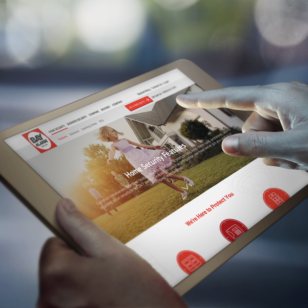
Bay Alarm is a leading provider of security systems for residential homes and businesses in California. Family owned since 1946, Bay Alarm is known for high-quality service and support. In an industry with a high employee turnover rate, Bay Alarm prides themselves in retaining highly trained employees that stay with the company on average over 10 years. Surprisingly, the Bay Alarm website was a reflection of their success. The focus on face-to-face customer service and support was strong. However, the fundamentals of good UX design needed improvement. It was hard to find information about security topics and alarm system solutions for residential and business visitors were buried deep within the site.

The original website reflected a one dimensional message.
THE CHALLENGE
Bay Alarm’s lead generation and knowledge sharing needed a fresh strategy. Working with Camp Media Arts, a holistic digital marketing agency with solid web application development and inbound marketing success, Bay Alarm recognized that the website could perform better.
Camp Creative/Camp Media Arts brought on UX design and strategy specialist, Daniel Castro, to lead a design thinking exercise and a UX design workshop.
Our goal for bayalarm.com: reflect the premium service that thousands of happy customers experienced, generate sales leads and provide a richer knowledge base to help visitors make informed decisions.
THE SOLUTION
Don’t Forget There’s a Human Behind the Screen
The human experience: Any digital effort that a brand undertakes, needs to reflect the basic wants, needs and fears of real people as they experience their service. Those are our UX design guiding principles. Our approach gave us insight into digital touch points with “brick and mortar” touch points such as call centers, or support.
Bringing the client and agency team together, we conducted an in-depth customer journey workshop. We drew our inspiration from several popular customer journey/service map tools created by Jakob Schneider & Marc Stickdorn and the Business Model Canvas by Strategyzer.
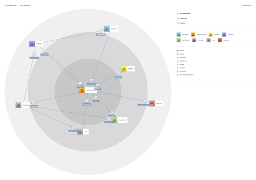
Bay Alarm Stakeholder Map
To understand what drives and motivates potential buyers of home alarm systems, we walked in their shoes for one day. As they first set out to contact Bay Alarm (via social media, direct response to a campaign, or word of mouth), the CMA and Bay Alarm teams joined together to follow the customer journey—from purchase to after-sale support. It was a fun and eye-opening exercise, even for long-time Bay Alarm employees. This journey became our compass for the content and overall design of the website.
Next, we created a persona based stakeholder service map. Bay Alarm has two primary markets, (business and residential) and each market had its own set of personas. We focused on the primary two personas since the stakeholders did not really change. This gave us a clear sense of possible gaps that existed and provided better visibility into potential opportunities in the future.
A Living Breathing Digital Ecosystem
Our UX strategist Daniel’s most important role was supporting the effort to educate the client. For example, the importance of seeing the website as a part of a whole “digital ecosystem” is often overlooked. Building a website in the traditional sense and leaving it until trends in design demanded a change, is a thing of the past. Customers and potential customers are digitally connected all day and expect that brands adapt to them. This means that a “redesign” is only the beginning and should be viewed as a collection of digital services that amplify each other. Testing played a major role in our design process. We ran several qualitative tests to ensure the collection of data supported hypotheses we made and provided insight for future iterations of the website.
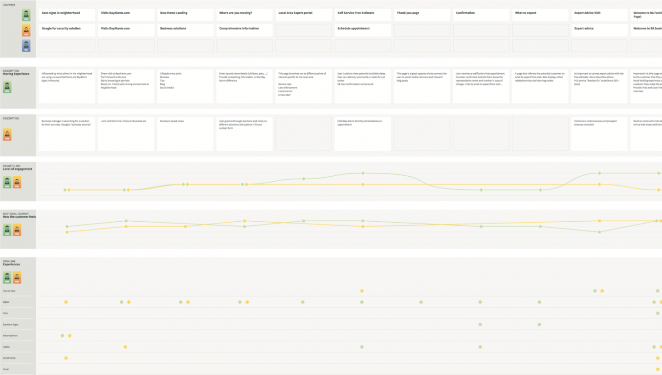
The Customer Journey
Mental Models
We conducted interviews to see what existing and potential customers thought about residential and home security. We discovered a strong correlation between major life events and the concern for security, monitoring, or general curiosity around technology options. This guided us in designing a site information architecture that mapped mental models of visitors as they experienced different stages of engagement.
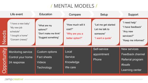
Mental models help us understand how people think.
Putting It All Together
– Content is everything.
– Optimize for “scanning” behavior.
– Don’t make users think too hard.
– Clear call to actions with minimal user input.
– Simplicity. Allow the content to shine through minimalism.
– Clear sense of hierarchy (the mind likes simple structure).
– Low cognitive load via white space and reduction of unnecessary “noise”.
– Test your designs.
A Sophisticated and Caring Neighbor
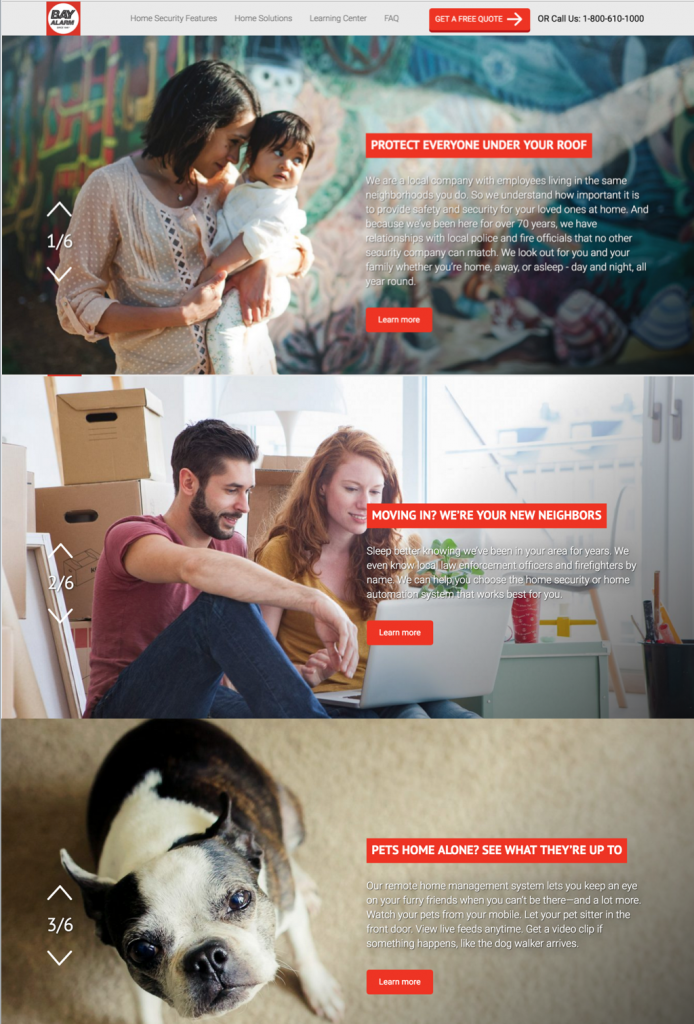
Customers chose Bay Alarm based on word of mouth, or because they saw the signs in the neighborhood. Customers also liked that Bay Alarm was a local California company. The information architecture and the design reflected this mindset, and our design reflected a “premium” voice and service. We removed information clutter and promotions that encourage customers to make informed choices to meet their goals.
Life events and lifestyles were featured as clear entry points for relevant content and services. Visual cues supported the idea that Bay Alarm was a ‘local company’ that cared for the neighborhood. The site displays beautiful scenic images of the local area that the visitor is viewing from LA, SF, San Diego and throughout their California service areas. Local branches display pictures of the local managers and contact information of the local branch. All these details tied nicely with the design choices for a visually rich and relatable imagery.
RESULTS
Initial user testing was very positive. Words such as “professional”, “appealing”, “care”, “get it” and others were used to describe the site. Visitors liked the aesthetic balance of content. The lifestyle approach was well received.
These results were similar for both residential as well as business! We’re happy to validate the advance effort and research required prior to the actual designs phases. This reflects the dedication and belief by Bay Alarm that these investments pay off in a better experience for customers. Since the site has gone live, leads are up over 400% and other conversion rates, and web statistics are trending up significantly. Check out bayalarm.com here!
CREDITS
Agency: Camp Creative
Creative Director: Richard L.Camp
Developer: Mike Hatfield
Project Management: Mike Stevens, Jamie King
UX Design Strategy/Information Architecture: Daniel Castro
Visual Design: Jordan Camp, Kevin Wong, Carolina Escobar
Copywriters: Bruce Tallerman, Karen Goldfarb
SEO: Jackie Richmond
Lead Workflows: Chuck Jones
Content Integration: Paula Stone