We put user experience design in service of people
Have you tried try to program your washer lately? With too many options, settings and arcane terminologies, we can sometimes feel disconnected from the basics of the task at hand. Making connections is what user experience design is all about. At the highest level, we connect your business objectives to what your audience wants from you. We provide the connective tissue between big-picture, strategic thinking and tactical features and functionality, between interface design and the underlying system that supports it. And most of all, we provide the connection between your audience and the things that matter to them.
What is user experience design?
User experience is much more than the interface design of a product. We like this definition from the Nielsen Norman Group.
User experience encompasses all aspects of the end-user’s interaction with the company, its services, and its products. The first requirement for an exemplary user experience is to meet the exact needs of the customer, without fuss or bother. Next comes simplicity and elegance that produce products that are a joy to own, a joy to use. True user experience goes far beyond giving customers what they say they want, or providing checklist features. In order to achieve high-quality user experience in a company’s offerings there must be a seamless merging of the services of multiple disciplines, including engineering, marketing, graphical and industrial design, and interface design. – Nielsen Norman Group
Apple is a great example of a company that has a seamless user experience. Everything from the OSX operating system to iTunes to the Apple Store feels interconnected and unified with consistent design and ease of use. An Apple laptop is more than a computer, it’s one piece of an integrated and seamless user experience that is the Apple ecosystem.
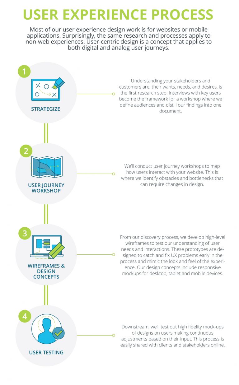
How we do it

Recently, a new subway extension was opened on the BART train (the Bay Area’s subway) connecting Oakland Airport to the rest of the track system. As I saw people struggling with getting their luggage through the turnstile gates of the new station it occurred to me that the building’s designers missed the mark on user experience: all regular BART stations have four or five narrow turnstiles and one extra wide turnstile. The extra wide turnstile allows people with luggage to easily enter through the gates. The smaller gates are too narrow for people carrying luggage. The result is a frustrating and embarrassing experience that gums up the works.
The designers made the gates the same as all other BART stations. Had they taken a user-centered design approach, they would have realized the obvious; virtually all passengers at this airport station have luggage. Every entry point could use an extra wide turnstile. Whether it’s creating a web experience or a airport subway station, putting the user first in the design process saves time and money.
— Richard Camp
